Monday 28 February 2011

Unbranded Magazine: new reflects old

Piece of design on old and new


words:

New styles will always reflect old ones, because nothing can be entirely uninfluenced by the past. Fashion, art, design, music, architecture: it’s all ideas taken from old ones (classics or forgotten wonders) and mashed up into something else. Why? It’s either because the world has run out of fresh ideas, or, the old ones were just so good that now, we don’t feel we can do anything better. We just copy (cmd+c), paste (cmd+v), then shuffle (ideas are like songs on itunes). Technology makes things easy. We should think of something to make creativity more of a challenge- that’s when it gets fun. 

Sunday 27 February 2011

Unbranded magazine: typewriter

Another little article piece about a typewriter and the poetic nature of writing.


Unbranded magazine: typography on buildings


I took these photographs around Birmingham and decided that they should be showcased in the magazine. Article reads:

Look around! typography is obviously everywhere, but do you ever actually stop and admire it? I love to see type on buildings… i find it almost an alien idea, which is why i think it is so beautiful. All of these pictures are in birmingham town centre or near BIAD campus. 

Worcester

Went to Worcester yesterday... visited the cathedral, and the museum. So here are some of my photos:


Really tiny gloves!
Worcester is well known for its history in glove making. It was so common in 'the olden days' that now their saying has developed- when talking about a 'Tom, Dick or Harry', when we might say here in the West Mids a 'Joe Blogs', they would say 'Joe Glover'.
some nice old pharmaceutical product packaging

 some 19th-20th century shoes- they were really small AND the heel must have been about 4 or 5 inches high! - I wouldn't like to try wearing those on a night out!
some more old leather shoes- bit more of a sensible heels on these ones!

More pharmaceuticals 

and more...

and even more!


Worcester sauce was made here. They had problems with people calling their recipes by the same name- so anyone can call theirs Worcester Sauce, but only Lea and Perrins' can call theirs original.


some old bottles and packaging of worcester sauce

Not too sure what this was for, but a lot of work definitely went into making it!

an old tin sign

Chinese Lea and Perrins' sauce advert

Chinese dragon

Look at the frogging on that!!

A nice bit of plastic signage


Iron railing art

Morris Minor

Antiques shop

Worcester Cathedral

A lot of nice stained glass in there!


HUGE bells

More amazing stained glass

This window was the biggest i've ever seen!

typography cast into one of the bells

The outside- looks quite spooky...

Friday 25 February 2011

stop motion

someone posted this beautiful stop motion on facebook and i just had to keep a record of it without cluttering up my bookmarks with every tiny thing i like. This one is definitely worth posting.


http://www.youtube.com/watch?v=m9Et7UQh1tg

Thursday 24 February 2011

DO THIS OR DIE


DDB
DO THIS OR DIE

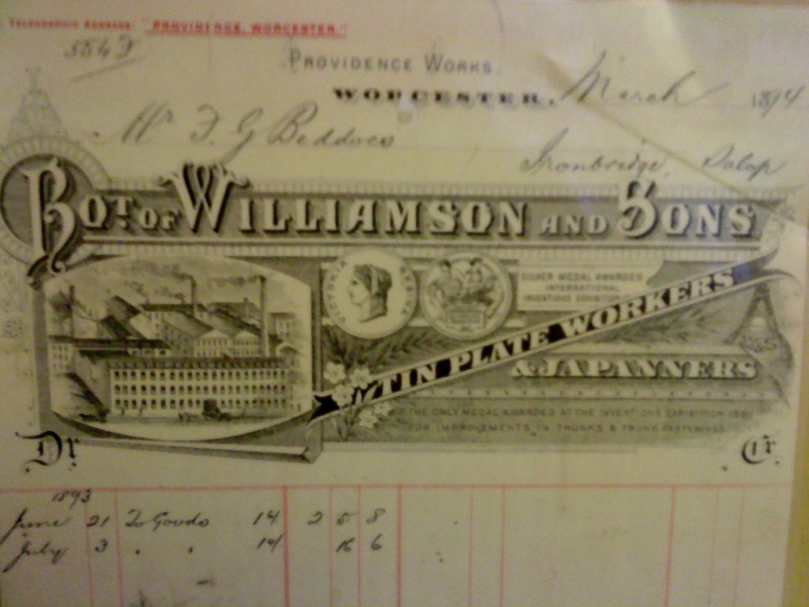
The DDB (Doyle Dane Bernbach Inc, now called DDB Worldwide Communications Group Inc) is an advertising agency which was funded in 1949 by it's founder, Bill Bernbach, Ned Doyle and Maxwell Dane. Bill Bernach was considered one of the most important people in the formation of  the “Creative Revolution” of the 60’s decade.
He described the ideology of the company with the phrase; "All of us who professionally use the mass media are the shapers of society. We can vulgarise that society. We can brutalise it. Or we can help lift it onto a higher level."
Since the early years of when the company formed, it had been distinguished for its philosophy which had an approach into respect for consumers, human nature, and the belief that "creativity is the most powerful force in business."

Swiss style had a huge influence on the designers of the sixties due to the internationalization of movement in the industry during that time. From this style, the work of this period took its simplicity and principle to communicate the message as clearly and objective as possible without distracting the audience by using ornaments, or 'decorative design' like in illustrations of past times. 

DDB's philosophy explains how it was possible that such a company with so well known reputation at the time had submitted an entry to an ad contest, and won which was entitled "DO this or DIE". This was not even an advertisement but a critique to the companies. It raised the subject of focus in offering good products to the market which are valuable to make publicity of, instead of tricking the public by advertising products that are bad to begin with.


The extremely large heading in bold sans serif type, taking up nearly half the page, catches the viewer's attention to begin with, especially with the red lines above and below it. The phrase is them even more striking and stated as a fact, using the full stop at the end. This is simple, clear and shocking. The text below, then reads;

Is this ad some kind of trick?  
No. But it could have been. And at exactly that point rests a do or die decision for American business. We in advertising, together with our clients, have all the power and skill to trick people. Or so we think. But we're wrong. We can't fool any of the people any of the time. There is indeed a twelve-year-old mentality in this country; every six-year-old has one. We are a nation of smart people. And most smart people ignore most advertising because most advertising ignores smart people. Instead we talk to each other. We debate endlessly about the medium and the message. Nonsense. In advertising, the message itself is the message. A blank page and a blank television screen are one and the same. And above all, the messages we put on those pages and on those television screens must be the truth. For if we play tricks with the truth, we die.  
Now. The other side of the coin. Telling the truth about a product demands a product that's worth telling the truth about. Sadly, so many products aren't. So many products don't do anything better. Or anything different. So many don't work quite right. Or don't last. Or simply don't matter. If we also play this trick, we also die. Because advertising only helps a bad product fail faster. No donkey chases the carrot forever. He catches on. And quits. That's the lesson to remember. Unless we do, we die. Unless we change, the tidal wave of consumer indifference will wallop into the mountain of advertising and manufacturing drivel. That day we die. We'll die in our marketplace. On our shelves. In our gleaming packages of empty promises. Not with a bang. Not with a whimper. But by our own skilled hands. 
 DOYLE DANE BERNBACH INC.

Not many advertising companies, of that time, or even now, would have published a text which criticises the same field they work for, but DDB were not afraid to. It is honest, insightful and above all, treats it's audience like it is intelligent enough to not be, or to at least stop being, consumer monkeys.

By the same principle, the Volkswagen Beetle adverts are a prime example of intelligent marketing.
In 1959 DDB created the famous 'Think Small' Volkswagen campaign, and told people to think on an VW as reliable, simple, different and an honest car.


This ad goes against the 'big american dream' of having everything and making it larger than life. Adds of that time were glamorous, attractive, and above all, did not appeal to those who did not have vast amounts of money to afford such luxuries, which was the majority. The 'think small' ad encourages them to feel okay about wanting something reliable, useful and affordable. It communicates to them on their level, rather than talking down to them with images of beautiful scantily-clad women leaning on an oversized, fuel guzzling 'dream car'.
Instead, it features merely a mass of white space and a tiny Volkswagen Beetle off centre of the page. The centred text is not large and over-powering, but simple, as if just a suggestion. This makes the viewer think that getting the car was their idea, not the advertiser's, who would usually tell them that they need it, not that it might be useful. The Volkswagen logo is also very small, as to not draw too much attention to the company, but again, just suggests the brand.


This ad, again using the same layout and small type, also puts across a strong message. In America, the term lemon is an insult to mean useless. The advertisers insult their own product by calling it by this name due to its size, which encouraged the consumers to think differently about what they are buying; to think about practicality and what is best for them, not the guys who make the money out of it. It looks like any other car ad, apart from the title, which makes it stand out from those in a subtle and intelligently humble way.

The campaign was so effective that it increased sales and also influenced the design of the 1998 campaign for the launch of the new Volkswagen Beetle. It used the same ad with only minor changes, to demonstrate its superiority over other campaigns.


The ad was simply a car, a logo and a strap line. Now colour ads can be published, the use of bold colour can help attract consumers, which the bright orange does, but that is the only punchy thing to do so. The logo is slightly larger and more memorable in blue, than on the old ads, but still not plastered all over, as if trying to brainwash people into needing the product. Also, wether the pun was intended or not, a flash back to it's hay day is hinted at with reference to the band from the 1960's, 'The Beatles', by using the name of the car and 'all you need', from one of their most famous songs which have the lyrics 'all you need is love'. 

Wednesday 23 February 2011

UNBRANDED

Our student publication UNBRANDED is getting up and running!
www.unbrandedmag.blogspot.com
Here's my poster for promotional purposes

and here it is in many beautiful colours

Sunday 20 February 2011

Installations- research for a project on childline

I found this interactive bar table installation for social places- I would love to have this at home!!


Thursday 17 February 2011

Coffee Shop Goes Digital!

Starbucks App (only in America)


http://vimeo.com/13213720 - watch video about app


"Just enter your Starbucks Card number and your iPhone becomes your Starbucks Card. You can register your card, check your balance and track the Stars you earn toward free beverages through My Starbucks Rewards.
We saved the coolest feature until last - you can pay for your drink using the Starbucks Card Mobile app! Enter your card number and your device will display a barcode you can use as your Starbucks Card to make purchases. It’s fast. It’s easy. And it’s a revolution in mobile payment. Mobile Pay is available at nearly 6,800 company-operated Starbucks stores, including all Target® Starbucks stores, in the United States. To find a store, use our Store Locator and select the Mobile Payment filter."


Dan and I came up with the same sort of idea for our task to allow a coffee shop chain 'go digital'... and then found this app, which was a great source of inspiration. 


Our flow chart, below, shows how the app will allow the user to follow prompts and make choices through the pages to eventually get to the purchase.


And here, below, are the wire frame designs for the pages, showing where images and buttons will be positioned. 


SO ME


^  Ed Banger Records
Art Director: SO ME
Justice, D.A.N.C.E


So-Me, A.K.A Bertrand De Langeron


'Portraits' Exhibition

"Fine art prints
Giclée prints on 100% cotton archival watercolour paper. Twenty-two original pieces, limited editions of five, signed and numbered by the artist.
$700 USD each plus applicable taxes, shipping and insurance."


"Portraits, will be the North-American debut for acclaimed French artist and illustrator So Me. This exhibition comprises a series of portraits done in So Me's trademark style, incorporating the vibrant colours and tongue-in-cheek references which define his work as Art Director for Ed Banger Records.
Like previous album-art designers such as Peter Saville and his relationship with Factory Records (Saville designed album art for Joy Devision and New Order), SO Me has found a way to make tangible albums relevant and worth while - a feat in today's world of digital music distribution. So Me provides the artistic and visual identity which accompanies Ed Banger Records' brand of music culture that has recently experienced tremendous growth - largely via the internet. So Me's work is often described as influenced by the iconic pop art of the 1960's, French comic books and graffiti, and contemporary iconography."


"In addition to creating album art, So Me has explored other channels of media. He has created award winning music videos for the likes of Kanye West, Justice, and DJ Mehdi, as well as prints, jewellery, and limited edition sets of t-shirts for H&M and Japanese clothing label Revolver. An aspiring comic book illustrator during his youth, the Paris-born So Me was influenced early on by skateboard culture, and was later affiliated with graffiti crews before gaining notoriety as a freelance magazine illustrator. He has worked for publications such as Collete, Arktip, Dazed, XLR8R, Clark Magazine, Sleazenation, and has created a Nike campaign for France."
http://www.studio.to/gallery.html


So-Me has an expressive, freehand style with hand rendered type and also, his images seem light-hearted. The bold, contrasting colours echo the fun mixture of font styles squeezed around each angle and curves. The words are squeezed into every corner, winding and bending, showing a lack of rigid grid structure and so reflects the artist's fun loving personality. He also changes his style of typeface for emphasis on certain words and uses words like 'waz' instead of was, making it quite cheeky and youthful. 
In this piece, the text is a commentary about the exhibition, marking his thoughts in quite an 'off the cuff' fashion, then rendered around the image. The combination of mustard yellow, deep pink and bold blue battle with the bombardment of black, thick outlines and type, on top of an off-white background, to make it visually striking.
His image making style, being inspired by comic books and pop art, is simplistic with high contrast and minimalistic highlights or shadows and large blocks of colour.
His use of white is a huge contrast to the bold, yet limited colour pallet in this piece, highlighting the whites of his eyes against the pink,emphasising how striking portraits tend to be, in that the viewer is first, naturally attracted to the eyes.