Monday 15 November 2010

Integrated Theory and Practice: Delivery

Display and guerilla advertising

Guerilla advertising uses the space around it, and enhances its aspects or structure to make use for its product, service or campaign in a visually striking way. It seems out of place and very noticeable to not only its target audience but also to people in the area in which it is situated; allowing it to grab the attention of many more people than for example, a poster on a wall, as it obstructs their everyday life or environment. Guerilla advertising is often extremely memorable and therefore very effective, especially for products as these items are usually larger than life and the brand name is large enough to be seen and recognised from a distance in a busy place. 

Tide Detergent:
Agency: Leo Burnett, Frankfurt
Leo Burnett: "To demonstrate the long lasting whiteness of Tide detergent, we created an outdoor poster in a really busy road, with constant heavy traffic. The poster was covered in cotton with self cleaning effect which over the course of a few weeks became more and more polluted, finally revealing a clothes line of brilliant white clothes."


The visual message of this is that even though the imaginary clothes have been subjected to high pollution levels; evident by the amount of dust and dirt surrounding it, they have remained white, conveying their message of 'longer lasting whites'.
Being positioned on a main road allows this advert to be seen by many people, both in cars and walking past, many of which may be the audience of home owners. The logo and tag line 'longer lasting whites' are quite small up in the top right hand corner, which encourages the audience to interact and search for the reason to this imagery. 
As the advert takes a while to come to life, those who pass the spot regularly will watch it materialise over a period of time and notice the change, making a larger impact on the local homeowners in the residential area. Therefore, there people are then more likely to see the logo often, and be more persuaded to buy the product. 
As cars will be going past as a fairly high speed, being a main road, the advert has to be large and long enough so that it is in view for an amount of time in which they notice it. Then, if they drive past again, they will be likely to look for the brand and will remember it. 

Hewlett Packard:
Agency: Publicis, Malaysia
"HP Advanced Photo Paper guarantees true-to-life image quality. To highlight this benefit, a standee was customised to give the impression that someone actually walked through a gigantic piece of paper and caused it to tear. Several of these standees were then placed at strategic locations to demonstrate to passers- by that what's real to their eyes is actually a reproduction using HP advanced Photo Paper."


Again, this advert is interactive in the sense that the audience feel compelled to get closer to inspect it. Then, they find out it is really an installation piece made to form an illusion. As they get closer, they see the logo and information on the ripped piece of paper. They are impressed by the clever advertising which causes them to remember the incident, as well as the brand and message of realistic quality associated with Hewlett Packard. In creating this advert, the designer had to take into account the perspective of the audience; so as to position it in a way where they will see it front on to enable the illusion to work. Also, to make it look real, they had to make the installation the real size of a human and place it somewhere busy in order to attract as many passers- by as possible. The size of the information causes the audience to interact as they need to get closer and then read it.

Accessorize:
Agency: Saatichi and Saatchi, Switzerland

The oversized beads threaded in-between bollards almost blend in to the environment as they are made to look like the chains which would usually occupy this space, but the bright colours are eye catching and strange which encourages passers-by to investigate. They then realise they are necklaces and find the giant price tag, along with the Accessorize logo. The audience for this advert is women, who are attracted by the colours and abnormal addition to the environment. As soon as they realise it resembles jewellery, they are already being persuaded to buy that product and others like it. This ad was placed in an open area, perhaps in a town centre, near shops and perhaps near to the Accessorize outlet. 

Integrated Theory and Practice: Interpretation

Interpretation of Walt Disney's Mickey Mouse

The Disney icon Mickey Mouse, recognisable all over the globe, has changed a lot over the years from it's first appearances in 1928 in 'Steamboat Willie'. His lines were expressive, hand rendered and simple, as were his colours bold, with minimum highlights and shadowing. His face was white, his eyes flattened black ovals, and his ears were small disc shapes, half the size of his head. 

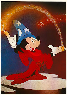
Later, developed the classic style we are more familiar with, seen in feature-length animations such as Fantasia, released in 1940. His character is adapted with new clothing such as the sorcerer's gown and hat, and his face becomes more expressive. His nose is given extra creases, his face is now pink, skin coloured, his eyes now are wider with white around and black pupils, his mouth is more of a pink tone, looking more realistic, and his hands are also more human-like, as well as having white gloves as apposed to yellow in the earlier illustrations. The shape of his face is also more sleek and streamlined, and his ears are much larger. His clothing has more colour and tone, giving him life. Graphic styles had become much more commercial and sleek, in accordance with mass production and the wide spread popularity of Disney Productions. This new style gave Mickey Mouse a lot of character and paved the way for commercial potential within the brand and illustrative style of animation. Newer versions, still hand-rendered, have also been given more highlight and shadow to add to the life-like effect. 


Since these initial interpretations, the general colouring and shapes have stayed very similar, however since the introduction of recent modern computer software, the commercial Disney and beginnings of CGI, new 3D style animations have given Mickey a new dimension and a shiny, plastic effect. Animations with this new style have been faster and easier to produce than the illustrated stop motion originals. This modern interpretation is often used on Disney merchandise for Mickey Mouse and many other Disney characters. 

Wednesday 3 November 2010

Integrated Theory and Practice: Film and Moving Image

Moving image: 3 acts structure

"Every movie needs to have a beginning, a middle and an end, but not necessarily in that order"- Jean-Luc Goddard.
The three acts in a film are made up of these parts. In the first act, the scene is set and at the end, the protagonist makes a commitment which leads to the events of acts 2 and 3. 

The Nightmare before Christmas (1993), the first full length stop motion animated feature film, was directed by Henry Selick, and the story and characters were written and designed by Tim Burton.
This film tells the story of Jack Skellington and Halloween Town, and how he discovers Christmas with the ambition to make it his own. 
In the first act of this film, a narrator sets the scene with the idea of there being portals into different worlds, introducing Halloween Town. The mood, setting and characters are shown through their celebration of halloween in a parade. Jack Skellington, the pumpkin king is the main character and also the main focus of this excitement at the beginning as a performer. This is the status quo and the original equilibrium of the story. Next we are taken into his own thoughts with a soliloquy which explains his feelings of boredom and need for change. This leads on to him stumbling into Christmas Town where he discovers the new holiday and is in awe of these new feelings. He commits the the idea of finding out more about this new land and aims to educate his town in hope to share his delight. This results in a misunderstanding and sets up the story for a sequence of events in which his exploration will go horribly wrong.
In 'the middle' part, act 2, Jack conducts scientific experiments in order to explain this new feeling he has about Christmas and to learn more. Frustrated, he becomes disheartened, but then comes up with the idea to make christmas his own and do the job of Santa himself. This leads on to the whole town being involved in the take over; making presents and setting him up for disaster. The nature of these characters is revel in horror, fright and all things dark which is the complete opposite of the real meaning of Christmas. Jack has Santa kidnapped and is left in the hands of Oogie Boogie, the antagonist who tries to kill him. Sally, the Frankenstein's creation type character tries to warn Jack that this will all end badly. He does not listen and delivers the presents, which begin to attack the people of Christmas Town. 
In act 3, the ending, the problems are resolved when the Christmas Town people attack Jack, and get rid of the dangerous toys. Sally saves Santa and Jack comes to his senses, being defeated. He realises that although he wanted adventure, it was not who he really was and is once again happy with a renewed love for his scaring nature. This is the new equilibrium: everything is back to normal but he now feels fulfilled again.
Also, 3 act films tend to have an 'inner story', often involving a romantic part to the story. In this film, Sally is in love with Jack, but he is too involved in his adventure to notice. She looks out for him, but not until the end do they realise they are meant to be together, as Jack's renewed state of mind allows him to notice her. 

Character design: Jack Skellington


The protagonist of the this film, Jack is the Pumpkin King of Halloween Town; a celebrity performer who is loved by all his fans for his ability to scare. The whole film is stop motion animation using hand crafted characters, designed by Tim Burton. His eerie style and dark designs portray Jack as a skeleton, tall and thin with extremely long limbs, wearing a pin stripe black suit with a bat shaped collar. His face is full of expression despite being only made up of two hollow eye sockets, two small nostril holes and a wide, half sewn up mouth and jagged teeth. 
Initially, he seems like a confident, extroversion character. However, his soliloquies reveal his sense of loneliness, boredom with the 'same old thing' and a need for adventure, in search of self discovery, showing his curious side. His exterior seems hard yet his interaction with others and passion portrayed through dialogue, animated, expressive movements and facial expressions allow us to see a deeper, emotional side to the character to make him believable, almost as a human character.
Initially, he finds an interest and means well by trying to share it with others and has ambitions of trying it himself. When it all goes wrong, his real self shines through as his nature, being from halloween town, is to scare and create terror, which is his realisation at the end. 


Integrated Theory and Practice: Creative Process

Drawing

In visual communication, the final outcome must be planned in detail. Designers will often first do rough sketches to put their ideas onto paper, then work out various aspects of the design such as position, angle, shape, text, layout and content in these initial drawings. 
Johnny Hardstaff, a graphic designer and animation director, has a large collection of sketchbooks containing his pre-production sketches and ideas. In these, he takes inspiration and reference from images he finds to work out shape. 
He also plans out the sequences in a story board style in order to work out the order of imagery, movement and makes notes to help design.


In animation and moving image, storyboards help to not only plan the sequence of events, but also the environment, camera angle, position and movement of characters, and even lighting. This part of the story board from Disney's Dumbo feature length animated film shows the interaction of the two characters; Dumbo and his mother in a sequence where he learns to walk and explore in his first few moments after being born. The artist uses faint line drawings as well as bold mark making in pen, with some shading to indicate the light source, style of character design, movement, surroundings and interaction by the characters. A whole film would be planned out in this way, to show the initial idea visually; which is far easier for the team to understand than in note form. In film, the sequence is then shot using this as a guideline. With drawn animation, it is even more important as it can give a sense of illustration style and movement to help the artists who will draw up the final frames. 
Initial ideas are easier to expand on when they are drawn, and a lot more can be explained with a simple image. For example, the mark making on the part of the image where Dumbo has fallen shows that he has fallen over using simple expressive strokes. 

Left and Right brain In Design

The brain can be described as being in two halves: the left side and the right side. Different types of signals and messages are transmitted to each side which controls certain actions. The left side is said to be more organised, analytical, logical; the decision making side. The right hand side, however, is the more playful, experimental, creative and emotional side; being more child-like and free. 
In design, we use the two halves together to create something inspired, yet useful and meaningful. First, we experiment and play with colours, shapes, content, and we are more spontaneous. Then, to put this into a context, we use our left side of our brain to analyse what we have made, evaluate what would be useful and ask ourselves how we can clarify this, choosing parts of the creation to help with how we convey the message. 

An example of the right brain is in this piece of experimental drawing by Jason Devine, he plays freely with marker pen straight on top of the pages of a book with no hesitation. His lines are untidy, spontaneous and child-like. The shapes and characters seem to be quite random without much thought, no context and not in any particular style. The colour is applied seemingly without much reason and the shapes are simple and playful. The type is quite freely drawn, but does have some thought behind it, and then he has added small swings onto the letterforms to give it a play on words.  More of his sketchbook work can be seen at this address: http://www.jasondevine.net/sketchbooks.html


In contrast, this page of a typography sketchbook by Claire Coullon shows her approach at designing a lowercase letter 'a'. Her lines are careful and far less confident than the previous example. The shapes in type must be thought out to fit with the rest of the letters and must also work and be legible. She has annotated her work, analysing which parts she feels work, and which do not, in order to re-design and adapt them.
The left brain is the part of us which looks at our work and criticises it so that we can improve and make sure we produce a final outcome which best answers what we set out to make.