Monday 13 December 2010

Integrated Theory and Practice: Milestones in Print Production

Ten Key Developments in the Production of Work:

1445          Johannes Guttenberg's printing press was invented in 1440 and in 1445, he produced the first printed book in Europe; the Gutenberg Bible. This led the way for many more printing machines to be invented with similar techniques, using movable type. The efficiency of using a machine in which only the type is changed, meant that books could be printed far more quickly than the traditional handwritten ways, allowing for there to be more produced, and therefore being cheaper and more widely available to the masses. 

1796-9     Alois Senefelder invented Lithography. This was the first new printing technology since the invention of relief printing in the fifteenth century. It is based on the chemical repellence of water and oil. The design is drawn or printed with a greasy ink or crayons onto prepared limestone. The stone is then moistened with water, which is accepted where the design is not drawn (as the water is repelled by the oils). An oily ink is applied with a roller and is only taken on where the drawing appears and is repelled by the wet areas. The stone is then pressed to paper to produce a print. This technology allowed for a level surface to be used for printing, so it could be re-used, and was much quicker than relief carvings. 

1798        A paper-making machine was invented by Nicolas-Louis Roberts. Since the invention of paper in China during AD 105, the amounts of paper available would be limited. By speeding up the process of manufacturing it, then it could become more efficiently produced and therefore cheaper and available to more people. 

1861        The first colour photograph was taken by Clerk Maxwell. This paved the way for design to be far more exciting and attractive with the addition of colour in photography, for realistic, life-like tones. 

1881        The halftone process was invented by Frederick Ives. This is a process by which the tones of a photographic image are represented by tiny dots of different sizes. The subject is photographed through a cross-line screen to produce a half-tone negative image, which is used to make a printing plate. A picture printed from this plate is made up of dots in proportion to the size of the light passing through the negative. This was the main factor in the expansion of illustrated newspapers and magazines during 19th century which lead to the high quality of newer productions of printed image. 

1886        The Linotype machine was invented by Ottmar Mergenthaler. This machine produces lines of metal type made from words all put together in a mould from molten metal, created when the operator types out on the keyboard the letters and words which are required. These lines of type are then used in the printing press. These lines are hard wearing and can be used to produce many copies. 

1920s      The Aniline process was developed for printing on non-absorbent stock. This meant that printers could print on materials such as cellophane and glossy papers for high quality finishes and a whole new approach to design and print production with interesting, tactile materials. 

1987       Adobe Illustrator was launched.

1990       Adobe Photoshop launched.

1999       Adobe InDesign and Press Ready launched. 

Computer software allows us to create high quality, high resolution designs ready for print and to be creative with production of imagery and type. The ease and speed of computers has also given many more people the ready skills in order to produce designs efficiently and cost effectively.


Integrated Theory and Practice: Gutenberg Press

In 1436, Johannes Gutenberg, a goldsmith and businessman from Mainz in Germany, invented the printing press. It had replaceable and movable wooden or metal letters. It was developed using the technology of a screw-type wine press and was operated by hand. Ink was rolled over the block letters which were held in a wooden frame, then it was pressed against a sheet of paper transferring the ink as printed type. He finished the printing press in 1440 and printed the first book in Europe, the 42-line (lines per page) Gutenberg Bible in 1445. 


This image of a press reproduction from the era shows the structure of the screw based machine. Below the printing plate was a sliding bench holding the inked metal type and a with a sheet of paper held in place to the surface. The bench slid into position below, the screw was turned and then the plate lowered to give pressure to the paper against the rows of type quickly and evenly. When the screw was turned in the opposite direction, the plate was raised. The bench was pulled back and the paper removed. This was repeated to produce many printed sheets efficiently.


Integrated Theory and Practice: Photography, Emotion and Text

Donna Ferrato

In order to investigate whether photographs can really capture emotion and what is happening, I flicked through a book of iconic photography and picked out a picture without looking at the description. I chose this image as it seemed very emotional and immediate.
My first interpretation was that the woman is angry at the photographer, her arm raised as if about to push her away. Her facial expression seems almost pleading as if she has had enough of being photographed or just wants to be alone. Her raised eyebrows and down turned mouth make her look as if she is crying as she speaks. 
I then began to read the description. This image is from Ferrato's book entitled 'Living with the enemy' 1991. Without reading any further on, I decided this could fit with my initial ideas in that the book could be about celebrities and the paparazzi, as if it is like living with photographers by being followed all the time. After reading on i discovered that it is about domestic violence against women in the USA. This adds new meaning to the photograph in the sense that the woman could be turning round to see someone behind her, the photographer, thinking it was her husband and is trying to defend herself. This would also explain her expression, being distraught and fearful. The rest of the text explains how the photographer came upon this topic by chance when she was staying with the family. She heard noises one night followed by the sound of blows and shouting and found the wife, Lisa, being attacked by her husband. This photo was taken moments after the event. 
Donna Ferrato's book contains case studies like this, accompanied by harsh monochrome pictures and texts and interviews. The relationships between text and photography is evidently critical in portraying a sense of the event in order for it to not be misinterpreted. 

Integrated Theory and Practice: Images and Words


In Magritte's pièce 'Les Mots et Les Images, based on children learning to read books, he painted pictures of object and labelled them with no relating words; a shoe labelled la lune (moon), an egg labelled l'acacia (a type of tree or shrub) a hat labelled la neige (snow), a glass labelled l'Orage (storm), a candle labelled le plafond (ceiling), and a hammer with the label la desert (desert). He notes that ‘everything tends to make us think that there is very little connection between an object and what represents it’ and that ‘an object never fulfils the same function’. He was influenced by the Surrealist movement and his art began to play with ideas linking language, representation and art. Most infamous is his painting of a pipe with the caption 'this is not a pipe'. This emphasises that the painting is not actually a real pipe but merely a representation of one, breaking the connection between language and objects. 
Magritte’s word-pictures provide a commentary on language and art; just as words are symbols, so are pictures and they need not necessarily resemble what they represent. Representation can be random  and anything can be used as a sign. 

"We usually attribute resemblance to things which may or may not have a common nature. We say ‘as alike as two peas in a pod’ and we say, just as easily, that the fake resembles the authentic. This so-called resemblance consists of relations of comparison, whose similarities are perceived by the mind when it examines, evaluates and composes. Likeness is not concerned with ‘common sense’ or with defying it, but only with spontaneously assembling shapes from the world of appearance in an order given by inspiration." – René Magritte 

Magritte suggests here that an image may look like an object, but in art it is not necessarily meant to be represent it or even have anything to do with it, but instead be a symbol for something, perhaps an emotion, memory or comparison based on metaphors or similarities it may have connected with it. 
In magritte's work, the strangeness and the startling effect of juxtaposing random words with images, is linked with the play of 'undecidability in representation', in that to put a word and an image together can lead us to question their connection and wether there really is one at all. 
The language barrier of the text being in french seems to add even more mystery as those who do not understand french will not have the immediate reaction of those who do. They may simply assume that the words are the french for those which match the image. This puts into question, again, how text can be non-representative of an image just as much as we believe it is the only one which matches it. 
This could mean, essentially, that words are merely labels we give to things for communication purposes, but representation is all in the mind of the artist, and the connection can then be made by anyone else, meaning we could represent anything with any object or word through any connection through metaphor or simile. 

This idea reminded me of an installation piece I once saw in the Tate gallery by Michael Craig-Martin; An Oak tree from 1973.

The display caption from April 2005:
"While this appears to be a glass of water on a shelf, the artist states that it is in fact an oak tree. Craig-Martin;s assertion addresses fundamental questions about what we understand to be art and our faith in the power of the artist. The work can be seen as an exploration of Marcel Duchamp's declaration that any existing object can be declared a work of art. In his accompanying text, Craig-Martin provides the questions as well as the answers, allowing the simultaneous expression of scepticism and the belief regarding the transformative power of art."
It is this 'transformative power of art' which draws on the same idea of the relationship between language and object as in Magritte's piece. 

Integrated Theory and Practice: Mind Mapping and organisation

In order to design an effective solution for what we wish to communicate, we have to explore the content of our design problem. 
Mind mapping allows us to put our thoughts down on paper and make connections to new ideas by exploring many different aspects of the subject matter. For example, for my health campaign brief about drinking water, I began by researching dehydration and the health benefits of drinking water. I also put down all my ideas about water as the subject so that I could get an idea of what imagery I could use and would be memorable in a campaign. 
I decided to explore my ideas on how the campaign could appeal to children as the target audience by making water seem more fun so that they would take an interest in their health. I continued my research into the subject so that I could define a target audience. I noted how I could inform the elderly about dehydration and the tone of voice to use for different audiences, and where the information could be so that it reaches the public. 
Throughout my project i returned again and again to idea of the mind map in order to 'go back to the drawing board' for new ideas and approaches to my final outcome. 


Integrated Theory and Practice: Creative Environments

The workplace, for a creative person, needs to be stimulating and full of inspiration for their next project. Designers often bring in personal touches which show their own interests and visual style which will help give them motivation to create something themselves which will then in turn inspire others.


Illustrator Jamie Hewlett's studio (above) has been labelled, pointing out various items which inspire him. 

Mad Magazine- an american magazine begun in 1950s America 'staffed by artists who used to work on ad campaigns such as Coca Cola and who relished being subversive and taking the mickey out of American culture'.
You can tell from this that he likes a bit of humour in his work and admires those who strive to be original and a bit controversial.

Nature- He has a model of a raven on his desk which reminds him of horror movies and the fact that he finds them hardest to draw. 
He challenges his own drawing skills by having this reminder beside him, tormenting him, while triggering memories which can inspire his work. 

Historical artefacts- he has an African mask and a French fireman's helmet. 
Being both interesting pieces of work in themselves and also historical references, these objects can remind him of cultural aspects of his work, as well as historical interests to spark his imagination in story telling and character design. 

The work of other creatives- he is inspired by the work of Quentin Blake and Ronald Searle. He has books containing examples of their style which he aspires to.


The Google offices seem like a very exciting place to work. If we work in an environment which allows us to have fun, our imagination is also allowed to be set free, which is very important for generating interesting ideas.


Monday 15 November 2010

Integrated Theory and Practice: Delivery

Display and guerilla advertising

Guerilla advertising uses the space around it, and enhances its aspects or structure to make use for its product, service or campaign in a visually striking way. It seems out of place and very noticeable to not only its target audience but also to people in the area in which it is situated; allowing it to grab the attention of many more people than for example, a poster on a wall, as it obstructs their everyday life or environment. Guerilla advertising is often extremely memorable and therefore very effective, especially for products as these items are usually larger than life and the brand name is large enough to be seen and recognised from a distance in a busy place. 

Tide Detergent:
Agency: Leo Burnett, Frankfurt
Leo Burnett: "To demonstrate the long lasting whiteness of Tide detergent, we created an outdoor poster in a really busy road, with constant heavy traffic. The poster was covered in cotton with self cleaning effect which over the course of a few weeks became more and more polluted, finally revealing a clothes line of brilliant white clothes."


The visual message of this is that even though the imaginary clothes have been subjected to high pollution levels; evident by the amount of dust and dirt surrounding it, they have remained white, conveying their message of 'longer lasting whites'.
Being positioned on a main road allows this advert to be seen by many people, both in cars and walking past, many of which may be the audience of home owners. The logo and tag line 'longer lasting whites' are quite small up in the top right hand corner, which encourages the audience to interact and search for the reason to this imagery. 
As the advert takes a while to come to life, those who pass the spot regularly will watch it materialise over a period of time and notice the change, making a larger impact on the local homeowners in the residential area. Therefore, there people are then more likely to see the logo often, and be more persuaded to buy the product. 
As cars will be going past as a fairly high speed, being a main road, the advert has to be large and long enough so that it is in view for an amount of time in which they notice it. Then, if they drive past again, they will be likely to look for the brand and will remember it. 

Hewlett Packard:
Agency: Publicis, Malaysia
"HP Advanced Photo Paper guarantees true-to-life image quality. To highlight this benefit, a standee was customised to give the impression that someone actually walked through a gigantic piece of paper and caused it to tear. Several of these standees were then placed at strategic locations to demonstrate to passers- by that what's real to their eyes is actually a reproduction using HP advanced Photo Paper."


Again, this advert is interactive in the sense that the audience feel compelled to get closer to inspect it. Then, they find out it is really an installation piece made to form an illusion. As they get closer, they see the logo and information on the ripped piece of paper. They are impressed by the clever advertising which causes them to remember the incident, as well as the brand and message of realistic quality associated with Hewlett Packard. In creating this advert, the designer had to take into account the perspective of the audience; so as to position it in a way where they will see it front on to enable the illusion to work. Also, to make it look real, they had to make the installation the real size of a human and place it somewhere busy in order to attract as many passers- by as possible. The size of the information causes the audience to interact as they need to get closer and then read it.

Accessorize:
Agency: Saatichi and Saatchi, Switzerland

The oversized beads threaded in-between bollards almost blend in to the environment as they are made to look like the chains which would usually occupy this space, but the bright colours are eye catching and strange which encourages passers-by to investigate. They then realise they are necklaces and find the giant price tag, along with the Accessorize logo. The audience for this advert is women, who are attracted by the colours and abnormal addition to the environment. As soon as they realise it resembles jewellery, they are already being persuaded to buy that product and others like it. This ad was placed in an open area, perhaps in a town centre, near shops and perhaps near to the Accessorize outlet. 

Integrated Theory and Practice: Interpretation

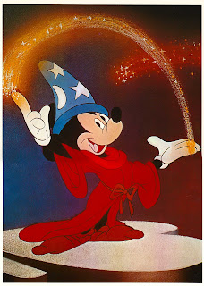
Interpretation of Walt Disney's Mickey Mouse

The Disney icon Mickey Mouse, recognisable all over the globe, has changed a lot over the years from it's first appearances in 1928 in 'Steamboat Willie'. His lines were expressive, hand rendered and simple, as were his colours bold, with minimum highlights and shadowing. His face was white, his eyes flattened black ovals, and his ears were small disc shapes, half the size of his head. 

Later, developed the classic style we are more familiar with, seen in feature-length animations such as Fantasia, released in 1940. His character is adapted with new clothing such as the sorcerer's gown and hat, and his face becomes more expressive. His nose is given extra creases, his face is now pink, skin coloured, his eyes now are wider with white around and black pupils, his mouth is more of a pink tone, looking more realistic, and his hands are also more human-like, as well as having white gloves as apposed to yellow in the earlier illustrations. The shape of his face is also more sleek and streamlined, and his ears are much larger. His clothing has more colour and tone, giving him life. Graphic styles had become much more commercial and sleek, in accordance with mass production and the wide spread popularity of Disney Productions. This new style gave Mickey Mouse a lot of character and paved the way for commercial potential within the brand and illustrative style of animation. Newer versions, still hand-rendered, have also been given more highlight and shadow to add to the life-like effect. 


Since these initial interpretations, the general colouring and shapes have stayed very similar, however since the introduction of recent modern computer software, the commercial Disney and beginnings of CGI, new 3D style animations have given Mickey a new dimension and a shiny, plastic effect. Animations with this new style have been faster and easier to produce than the illustrated stop motion originals. This modern interpretation is often used on Disney merchandise for Mickey Mouse and many other Disney characters. 

Wednesday 3 November 2010

Integrated Theory and Practice: Film and Moving Image

Moving image: 3 acts structure

"Every movie needs to have a beginning, a middle and an end, but not necessarily in that order"- Jean-Luc Goddard.
The three acts in a film are made up of these parts. In the first act, the scene is set and at the end, the protagonist makes a commitment which leads to the events of acts 2 and 3. 

The Nightmare before Christmas (1993), the first full length stop motion animated feature film, was directed by Henry Selick, and the story and characters were written and designed by Tim Burton.
This film tells the story of Jack Skellington and Halloween Town, and how he discovers Christmas with the ambition to make it his own. 
In the first act of this film, a narrator sets the scene with the idea of there being portals into different worlds, introducing Halloween Town. The mood, setting and characters are shown through their celebration of halloween in a parade. Jack Skellington, the pumpkin king is the main character and also the main focus of this excitement at the beginning as a performer. This is the status quo and the original equilibrium of the story. Next we are taken into his own thoughts with a soliloquy which explains his feelings of boredom and need for change. This leads on to him stumbling into Christmas Town where he discovers the new holiday and is in awe of these new feelings. He commits the the idea of finding out more about this new land and aims to educate his town in hope to share his delight. This results in a misunderstanding and sets up the story for a sequence of events in which his exploration will go horribly wrong.
In 'the middle' part, act 2, Jack conducts scientific experiments in order to explain this new feeling he has about Christmas and to learn more. Frustrated, he becomes disheartened, but then comes up with the idea to make christmas his own and do the job of Santa himself. This leads on to the whole town being involved in the take over; making presents and setting him up for disaster. The nature of these characters is revel in horror, fright and all things dark which is the complete opposite of the real meaning of Christmas. Jack has Santa kidnapped and is left in the hands of Oogie Boogie, the antagonist who tries to kill him. Sally, the Frankenstein's creation type character tries to warn Jack that this will all end badly. He does not listen and delivers the presents, which begin to attack the people of Christmas Town. 
In act 3, the ending, the problems are resolved when the Christmas Town people attack Jack, and get rid of the dangerous toys. Sally saves Santa and Jack comes to his senses, being defeated. He realises that although he wanted adventure, it was not who he really was and is once again happy with a renewed love for his scaring nature. This is the new equilibrium: everything is back to normal but he now feels fulfilled again.
Also, 3 act films tend to have an 'inner story', often involving a romantic part to the story. In this film, Sally is in love with Jack, but he is too involved in his adventure to notice. She looks out for him, but not until the end do they realise they are meant to be together, as Jack's renewed state of mind allows him to notice her. 

Character design: Jack Skellington


The protagonist of the this film, Jack is the Pumpkin King of Halloween Town; a celebrity performer who is loved by all his fans for his ability to scare. The whole film is stop motion animation using hand crafted characters, designed by Tim Burton. His eerie style and dark designs portray Jack as a skeleton, tall and thin with extremely long limbs, wearing a pin stripe black suit with a bat shaped collar. His face is full of expression despite being only made up of two hollow eye sockets, two small nostril holes and a wide, half sewn up mouth and jagged teeth. 
Initially, he seems like a confident, extroversion character. However, his soliloquies reveal his sense of loneliness, boredom with the 'same old thing' and a need for adventure, in search of self discovery, showing his curious side. His exterior seems hard yet his interaction with others and passion portrayed through dialogue, animated, expressive movements and facial expressions allow us to see a deeper, emotional side to the character to make him believable, almost as a human character.
Initially, he finds an interest and means well by trying to share it with others and has ambitions of trying it himself. When it all goes wrong, his real self shines through as his nature, being from halloween town, is to scare and create terror, which is his realisation at the end. 


Integrated Theory and Practice: Creative Process

Drawing

In visual communication, the final outcome must be planned in detail. Designers will often first do rough sketches to put their ideas onto paper, then work out various aspects of the design such as position, angle, shape, text, layout and content in these initial drawings. 
Johnny Hardstaff, a graphic designer and animation director, has a large collection of sketchbooks containing his pre-production sketches and ideas. In these, he takes inspiration and reference from images he finds to work out shape. 
He also plans out the sequences in a story board style in order to work out the order of imagery, movement and makes notes to help design.


In animation and moving image, storyboards help to not only plan the sequence of events, but also the environment, camera angle, position and movement of characters, and even lighting. This part of the story board from Disney's Dumbo feature length animated film shows the interaction of the two characters; Dumbo and his mother in a sequence where he learns to walk and explore in his first few moments after being born. The artist uses faint line drawings as well as bold mark making in pen, with some shading to indicate the light source, style of character design, movement, surroundings and interaction by the characters. A whole film would be planned out in this way, to show the initial idea visually; which is far easier for the team to understand than in note form. In film, the sequence is then shot using this as a guideline. With drawn animation, it is even more important as it can give a sense of illustration style and movement to help the artists who will draw up the final frames. 
Initial ideas are easier to expand on when they are drawn, and a lot more can be explained with a simple image. For example, the mark making on the part of the image where Dumbo has fallen shows that he has fallen over using simple expressive strokes. 

Left and Right brain In Design

The brain can be described as being in two halves: the left side and the right side. Different types of signals and messages are transmitted to each side which controls certain actions. The left side is said to be more organised, analytical, logical; the decision making side. The right hand side, however, is the more playful, experimental, creative and emotional side; being more child-like and free. 
In design, we use the two halves together to create something inspired, yet useful and meaningful. First, we experiment and play with colours, shapes, content, and we are more spontaneous. Then, to put this into a context, we use our left side of our brain to analyse what we have made, evaluate what would be useful and ask ourselves how we can clarify this, choosing parts of the creation to help with how we convey the message. 

An example of the right brain is in this piece of experimental drawing by Jason Devine, he plays freely with marker pen straight on top of the pages of a book with no hesitation. His lines are untidy, spontaneous and child-like. The shapes and characters seem to be quite random without much thought, no context and not in any particular style. The colour is applied seemingly without much reason and the shapes are simple and playful. The type is quite freely drawn, but does have some thought behind it, and then he has added small swings onto the letterforms to give it a play on words.  More of his sketchbook work can be seen at this address: http://www.jasondevine.net/sketchbooks.html


In contrast, this page of a typography sketchbook by Claire Coullon shows her approach at designing a lowercase letter 'a'. Her lines are careful and far less confident than the previous example. The shapes in type must be thought out to fit with the rest of the letters and must also work and be legible. She has annotated her work, analysing which parts she feels work, and which do not, in order to re-design and adapt them.
The left brain is the part of us which looks at our work and criticises it so that we can improve and make sure we produce a final outcome which best answers what we set out to make. 


Friday 22 October 2010

Integrated Theory and Practice: Visual Hierachy

Film posters:
Content is the most important thing to attract viewers, therefore the image tends to be the main thing that is used to attract an audience. In this Alice in Wonderland poster, the first thing we notice is the face. The contrast of orange and green emphasises this main point of focus, as well as it being in the centre of the page. Next, is the name of the film. It is quite small and in the bottom right hand corner, however being in white on top of a dark colour background, it stands out. Then is the type above the character at the top, also in white but on a lighter green background, and it is further away from the main focus, making it less noticeable. Then the date and place, and finally the film credits. This visual hierarchy shows how the size of an object or type can make us notice it first or last, as well as where it is positioned in relation to the main focus.
Magazines:
Vogue cover

This magazine would be on a shelf amongst hundreds of others, fighting for visual dominance. The first thing which stands out is the red title of Vogue due to the contrast among the green background and it being the largest type on the page. Next is the woman as a face will always attract out attention. Then the large '50' in red, despite it being a low weight typeface and then the 3rd red toy 'Kate Hudson'. After this, the white and black type catch out attention but are similar sizes. The huge amount of information on a magazine cover needs to be categorised into the most important and least important in order to not bombard the viewer with too much information at one time, which would risk them not being attracted by it at all. 
Some magazines, however, do not need to put so much information on at once as they can grab the audience's attention with perhaps a single image, like this Creative review (Jan 2010)

The black car on a yellow background instantly gives a striking visual effect, as do the bursts of red and white on the black. Our eye is then led up to the top left hand corner to the the 'CR' in black on white, again, a bold contrast and then the small type saying 'creative review', and finally the smallest type below that. 
If these two magazine were next to each other, the large block of yellow on a magazine stand would definitely catch someones attention first as yellow is the brightest and the larger the area of a colour, the more it stands out. 

Newspapers:

On this cover, first in the visual hierarchy is the largest typeface; the main headline. The black and white contrast causes it to stand out, but even more so that the yellow and blue 'GI DIET' advert, as it takes up more space on the page. 3rd would be the image of Kiera Knightley or 'Daily Mail' due to the contrast of light and dark. Next is the 2nd image, and finally the smaller heading, then the body copy. Newspapers tend to put more importance on the main story with a large headline, than on the newspaper name as it is all about who has the best, most shocking story to cause the audience to buy the paper. Also, whoever may be on the cover, the same applying to magazines, could influence this decision as they are often celebrities and people want to find out about their lives, so they are a large focus of the front page stories. 

Integrated Theory and Practice: Legibility

"The Bauhaus was a German art school which existed from 1919 through 1933.  No other institution has had the profound influence on 20th century design as the Bauhaus.  It was founded by architect Walter Gropius in the city of Weimar.   Founded on the principles of the Arts and Crafts movement, the aim of the Bauhaus was to incorporate art and industry. In 1925, the Bauhaus moved to Dessau.  It was during this year that the young Austrian artist, Herbert Bayer, was appointed to head the printing and advertising workshops in Dessau." (http://www.type.nu/bayer/index.html)
'The new typography' was a huge influence on modern graphic design, being all about functionality and purpose, which meant being legible was its only aim to convey the message. The pleasing aesthetic was a by-product of this clean, straight forward approach in the early 20th century.
Herbert Bayer's poster for Kandinsky's 60th Birthday:

This piece uses bold, black type against a cream background and minimal use of colour. First of all, the typeface he has used is large enough to be seen from a distance, apart from the smaller details which would be legible of course from up close when the viewer has already been attracted by the poster. The contrast of black on cream, and black on orange gives a striking visual as the colours vibrate. Most of the text is in capital letters, which causes it to be harder to read, however it is in keeping with the block, grid format of this piece.
"The metaphor of “transparent type” was coined by Beatrice Warde, Monotype Imaging's famous marketing manager of the 1930s and 40s. She once wrote in an article that good type is like “a crystal goblet” which allows content to be more important than the container. Warde contended that the best types do not get in the way of the communication process: these faces are virtually invisible and allow words to make the statement–not the type." (http://www.fonts.com/AboutFonts/Articles/Typography/Legibility.htm)
"Helvetica was developed in 1957 by Max Miedinger with Eduard Hoffmann at the Haas'sche Schriftgiesserei (Haas type foundry) of Münchenstein, Switzerland. Haas set out to design a new sans-serif typeface that could compete with the successful Akzidenz-Grotesk in the Swiss market. Originally called Neue Haas Grotesk, its design was based on Schelter-Grotesk and Haas’ Normal Grotesk. The aim of the new design was to create a neutral typeface that had great clarity, no intrinsic meaning in its form, and could be used on a wide variety of signage." (http://en.wikipedia.org/wiki/Helvetica)


American Airlines
Designed by Vignelli Associates, in 1967

This logo is extremely legible with its helvetica "crystal goblet" font and striking blue and red. On top of white, the colours convey the red blue and white american flag colours but also are made all the more legible. Even though the words are not spaced apart, the difference in colour distinguishes them from one another allowing us to see it as two words. 
Stefan Sagmeister's poster for lou reed's set in the twilight reeling 1996

His use of hand rendered type adds a unique quality but is not entirely legible. However, information which is needed for the viewer to understand, such as the name and title, is legible enough. The rest is simply lyrics and therefore their communication is not as important but is instead simply for the aesthetic quality.

Integrated Theory and Practice: Visual Research

Keeping a sketchbook allows a designer or illustrator to note down ideas, lists and interesting findings, as well as record what they see and collect which inspires them in their work and everyday thoughts. When we see something that captures our imagination, such as an interesting building or a scene we see happening, we feel the need to remember it and so recording this is the best way to do so. Photographers may take a quick snap shot, illustrators or designers may sketch it or write it down and brainstorm ideas from this. We also may find things such as train tickets, leaflets or food wrappers which we like, and want to keep for future reference as they inspire us in either being well designed, imaginative or may just simply be attractive. Things we like are very likely to inspire what we create as we aim for a certain style for our final outcome to be like.

Director, graphic and moving image designer Johnny Hardstaff collects all sorts of information graphics, stickers, images, examples of artworks and then uses these as inspiration or reference for his designs, sketching along side these in his sketchbooks, drawing from these shape, colour, texture, layout and concept.  "Amongst his most notable works to date remain 'History of Gaming' and 'Future of Gaming' (two politically provocative short films designed to first engender then test corporate patronage, now inducted into the National Film Archive), the Radiohead film 'Like Spinning Plates' (long format two track experimental music video), a contemporary raft of innovative design based commercials (Sony / Asics / Orange / MTV etc) and the 2010 future noir short film 'DarkRoom'." 


Simply recording what we see by sketching it is a useful exercise to improve our drawing skills and encourages us to look at the world around us, taking inspiration from this while learning about perspective, form, shape, texture and colour. We can then also experiment with different media to then translate into our work these initial ideas and research. I have selected a few videos showing sketchbooks by artists and designers which I find interesting. They show the thought processes and experimentation of their work, the development of a style and how they see things, then interpret them into a new visual representation for recording.


If a designer or illustrator needs to create a piece of work about a certain topic, they would need to research into different aspects such as the history and context. Information is needed to gain a greater knowledge of what we see so that we can understand something and therefore draw or design it well. Reading books also helps with vocabulary in order to describe, as well as allowing a designer's imagination to expand and give them inspiration by creating a visual for their initial ideas about a subject. Secondary research allows us to expand our knowledge using what other people have found and collected, then put together to make it easier for us to find the information such as in a book or on the internet. When an illustrator or designer is looking for inspiration, they may look at other artist's work and their style as way of working as an influence as to how to go about doing a new piece of work. 
A designer may look at how colour can be used to attract attention to their piece of work, or how it has an impact on who the audience is. For example, a children's illustrator would need to research the stages of development in reading and learning to produce a book for younger children, as well as how to use colour well so as to attract their attention. On a page of Johnny Hardstaff's sketchbooks, he has researched colour blindness tests to see how colours interact with one another so he can use this in his work to produce a striking visual. 
In his sketchbooks he has also taken images for visual reference from which to draw from so that he can get a sense of colour, shape and form.